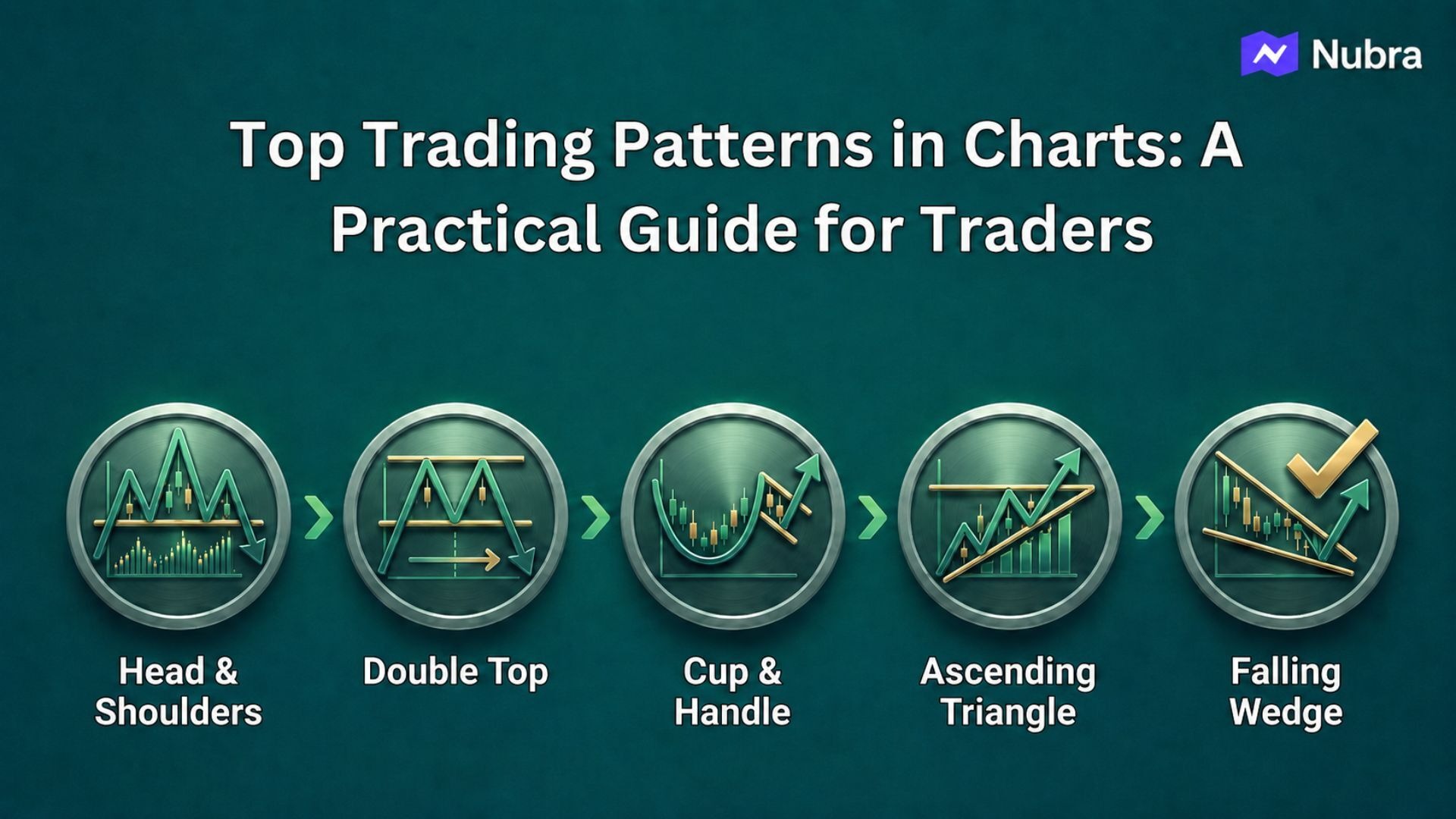
When you open a chart, the first problem is usually not a lack of information. It is too much information. Candles are moving, indicators are flashing, news is changing sentiment, and every small swing can start to look important.
Chart patterns help because they give that movement a structure. They help you ask better questions: is price trending, pausing, rejecting a level, building pressure, or losing momentum?
My view is that a chart pattern should not be treated like a signal by itself. A good pattern is more like a trading brief. It tells you what the market appears to be doing, where the setup becomes interesting, and where your idea is probably wrong. The pattern is the starting point. The plan is what makes it useful.
That distinction matters. A head and shoulders, double top, triangle, flag, wedge, or rectangle can look clean after the move is over. In live markets, the same pattern is usually incomplete, noisy, and emotionally difficult to read. That is why experienced traders do not just ask, “Which pattern is this?” They ask, “What would confirm this, what would invalidate it, and is the risk worth taking?”
This guide covers the top trading patterns in charts from that practical angle.
What Chart Patterns Actually Tell You
Most chart patterns are built from three basic ideas: trend, support and resistance, and participation.
If price rises, pauses, and then breaks higher, the market may be showing continuation. If price rises, fails twice near the same zone, and then breaks support, it may be showing a reversal. If price keeps compressing between two trendlines, traders may be waiting for a breakout before committing in either direction.
The pattern is useful only when it helps you define the trade more clearly. Before acting on any setup, ask:
- What was the trend before the pattern formed?
- Which levels are buyers or sellers defending?
- What would count as confirmation?
- Where is the setup invalidated?
- What happens if the breakout fails?
The last two questions are where many traders get better. It is easy to find a shape on a chart. It is harder to decide, in advance, what would prove that your read is wrong.
Types of Trading Chart Patterns
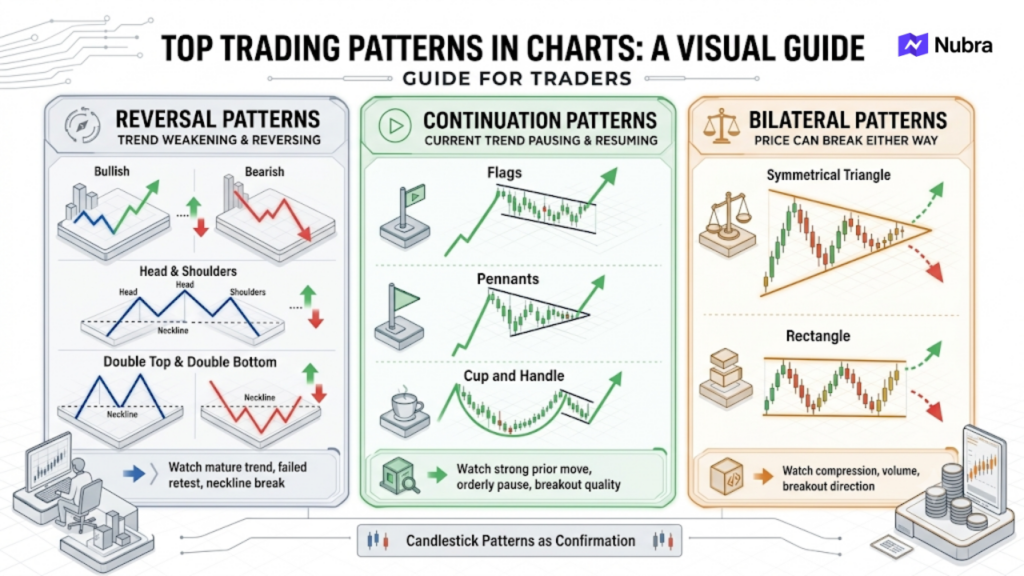
| Pattern type | What it suggests | Examples | What you should watch |
|---|---|---|---|
| Reversal patterns | The existing trend may be weakening | Head and shoulders, double top, double bottom | Mature trend, failed retest, neckline break |
| Continuation patterns | The current trend may be pausing | Flags, pennants, cup and handle | Strong prior move, orderly pause, breakout quality |
| Bilateral patterns | Price can break either way | Symmetrical triangle, rectangle | Compression, volume, breakout direction |
The same shape can mean different things in different markets. A five-minute flag on expiry day is not the same as a daily flag in a stock that has been trending for weeks. A wedge near a major support zone should not be read exactly like a wedge after a one-way rally. Context comes first.
Head and Shoulders
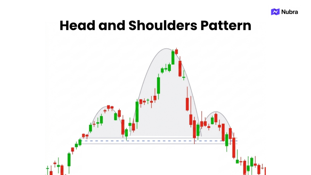
The head and shoulders pattern is a bearish reversal setup that usually forms after an uptrend. It has three peaks: a left shoulder, a higher head, and a right shoulder that fails to make a new high. The neckline connects the pullback lows.
If you are reading this pattern live, the key is patience. The right shoulder may look obvious before it is complete, but the setup usually becomes meaningful only when price breaks the neckline. Until then, it is just a possible structure.
Imagine a stock moves from 920 to 1,040, pulls back, rallies again to 1,085, and then fails near 1,045. If the neckline is around 995, the cleaner decision point is not the right shoulder itself. It is whether price can break and sustain below 995. If it cannot, the bearish read is still unconfirmed.
The inverse head and shoulders works in the opposite direction. It forms after a downtrend and suggests that sellers may be losing control. Here too, the neckline matters. A trader who enters too early may be right about the shape but wrong about the timing.
The practical lesson: do not trade the drawing. Trade the level that confirms or rejects the drawing.
Double Top and Double Bottom
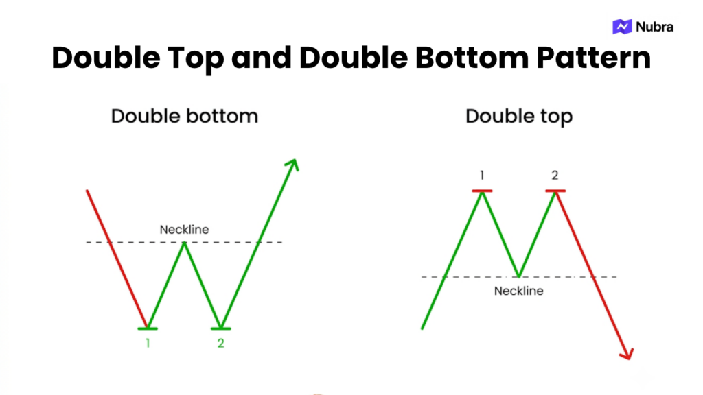
A double top forms when price tests a resistance zone twice and fails to break through. It becomes more relevant when price then breaks the support between the two peaks. A double bottom is the bullish version, where price tests support twice and confirms only after breaking the resistance between the two lows.
These patterns are easier to evaluate when the second test tells you something new. For example, if Bank Nifty rejects 57,800 twice, you should not automatically assume a double top. The better question is: what happened on the second attempt? Was momentum weaker? Did price spend less time near the high? Did sellers respond faster? Did the intermediate support break?
Many failed double tops come from reading the second peak as confirmation. It is not. Markets often retest highs before continuing higher. The actual confirmation usually comes when the support between the two peaks breaks.
The same applies to double bottoms. A second bounce from support can be encouraging, but the setup becomes stronger only when price starts reclaiming the resistance that sellers previously defended.
Cup and Handle
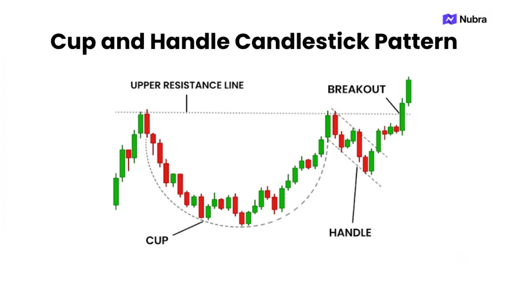
The cup and handle is usually treated as a bullish continuation pattern. Price rises, corrects in a rounded way, recovers toward the prior high, and then forms a smaller pullback called the handle. Traders watch whether price can break above the handle or prior resistance.
What I like about this pattern is that it forces you to think about time. A good cup is not just a quick dip and bounce. It often reflects a period where early buyers exit, late sellers lose interest, and new buyers gradually step in. The handle then becomes a smaller test of whether the market can absorb profit booking before another breakout attempt.
In Indian equity charts, you may see this after a sector has already moved but one stock spends time consolidating below its previous high. The setup can look attractive, but it still needs a clear breakout zone. If price breaks out and immediately falls back into the handle, the market is telling you that the breakout was not accepted.
Do not force this pattern onto every U-shaped move. A cup and handle needs prior trend context, a reasonable base, a handle that does not collapse too deeply, and a level where the market clearly shows acceptance or rejection.
Ascending, Descending, and Symmetrical Triangles
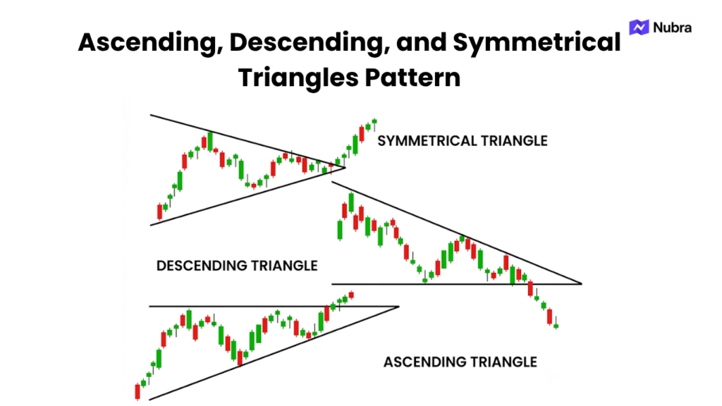
Triangles show compression. They are useful because they tell you that the market is narrowing its range and preparing for a decision.
An ascending triangle has flat resistance and rising support. Buyers are stepping in at higher levels, but sellers are still defending the same ceiling. If price breaks above resistance with follow-through, traders may read it as bullish.
A descending triangle has flat support and falling resistance. Sellers keep pushing lower highs while buyers defend the same floor. A breakdown below support may suggest that buyers have stopped absorbing supply.
A symmetrical triangle is more neutral. Both sides are compressing. This is where traders often get impatient. The chart looks ready, but it has not chosen a direction yet.
Consider Nifty before a major event or policy announcement. Price may compress for several sessions, creating a neat triangle. If you enter inside the triangle because it “looks close,” you are making the decision before the market has made one. A better workflow is to prepare both scenarios: what you would do if price breaks above resistance, and what you would do if it breaks below support.
The best triangles are not the prettiest ones. They are the ones where your trigger and invalidation are clear.
Flags and Pennants
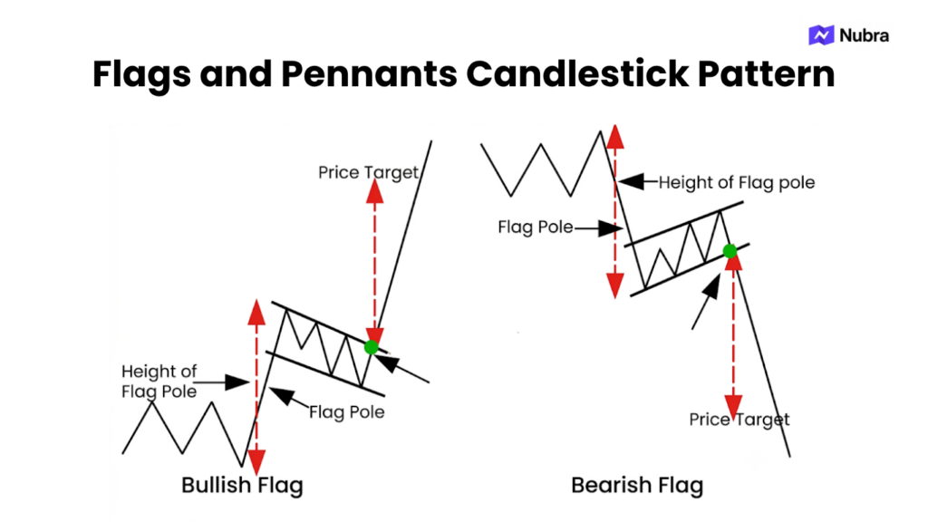
Flags and pennants are continuation patterns that form after a sharp directional move.
A flag looks like a small channel against the main trend. A bullish flag forms after a strong upward move and then drifts down or sideways. A bearish flag forms after a sharp fall and then bounces or consolidates before another possible move lower.
A pennant is similar, but the consolidation is tighter and more triangular.
These setups appeal to intraday traders because they are compact. That is also what makes them risky. On a lower timeframe, a flag can turn into a failed breakout within minutes. If you trade F&O or short-term index moves, the pattern needs to be read with liquidity, volatility, and event timing in mind.
The detail that matters is the move before the pause. A flag without a strong prior move is often just a small range. If there is no clear impulse, there may be nothing meaningful to continue.
Wedges
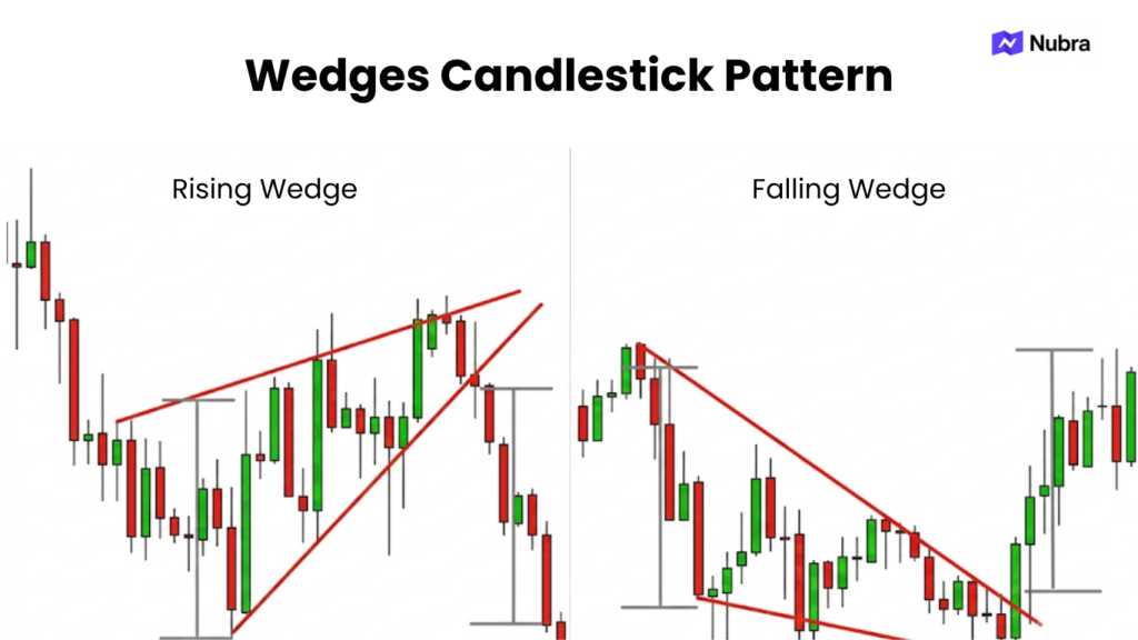
Wedges form when two trendlines slope in the same direction and converge. A rising wedge slopes upward and can warn that an uptrend is losing strength. A falling wedge slopes downward and can suggest that a downtrend is losing strength.
The word “can” is important. Wedges are easy to over-read. A rising wedge does not have to fall immediately. A falling wedge does not have to rally. The pattern only becomes useful when price breaks the structure and gives you a level to work with.
If you are looking at a rising wedge after a long rally, ask whether each new high is getting weaker. Is volume fading? Are candles showing rejection near the upper trendline? Is the lower trendline finally breaking? These details are more useful than simply labeling the pattern bearish.
In my experience, wedges are best treated as warning structures. They tell you to stop assuming the trend is healthy. They do not remove the need for confirmation.
Rectangles and Trading Ranges
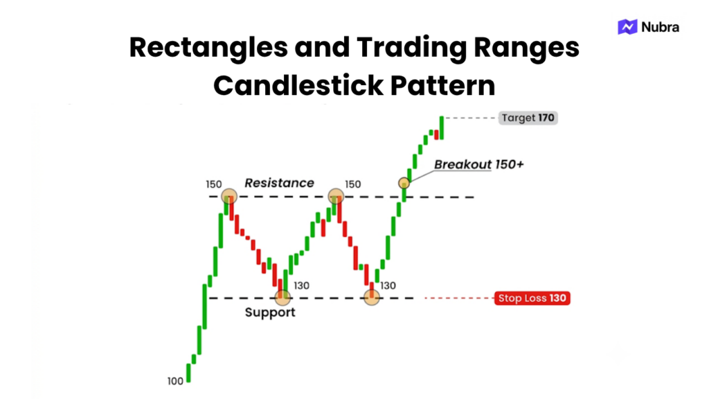
A rectangle forms when price keeps moving between horizontal support and resistance. Buyers are active near the lower boundary, sellers are active near the upper boundary, and neither side has taken control.
This pattern is simple, but it tests discipline. If a stock keeps bouncing between 480 and 505, you need to know whether you are trading the range or waiting for a breakout. Those are different plans.
Inside the range, a trader may watch reactions near 480 and 505. Above 505, the breakout case becomes active. Below 480, the breakdown case becomes active. What usually hurts traders is mixing the two. They enter as range traders, then refuse to exit when the range breaks because they suddenly become breakout traders.
The rectangle is useful because it draws a clean boundary around that decision.
Candlestick Patterns as Confirmation
Candlesticks show open, high, low, and close for a chosen period. That makes them useful for reading short-term pressure.
A bullish engulfing candle near support can show buyers stepping in. A bearish engulfing candle near resistance can show sellers rejecting higher prices. A doji can show indecision. But these candles mean more when they appear at important levels.
A bullish candle in the middle of a noisy chart is not the same as a bullish candle at the neckline of an inverse head and shoulders. A bearish candle after a failed breakout is not the same as a bearish candle inside a random sideways range.
This is where chart reading becomes more practical. You are not collecting patterns. You are building evidence. Structure gives you the location. Candlesticks help you read the reaction.
A Pattern-to-Plan Workflow
Before using any chart pattern, convert it into a plan:
| Step | Question |
|---|---|
| Context | What was the trend before the pattern? |
| Structure | Which levels define the pattern? |
| Trigger | What confirms the setup? |
| Invalidation | Where is the setup wrong? |
| Risk | What is the maximum acceptable loss if wrong? |
| Review | Did the trade follow the plan, regardless of outcome? |
This is where tools matter. In a structured trading workflow, you should not stop at spotting the pattern. Mark the structure, define the trigger, test the scenario, and decide whether the risk is acceptable before acting.
Nubra can fit into this kind of planning mindset by helping traders think in terms of workflow, scenario review, and risk awareness. Tools can support analysis and discipline, but they do not guarantee outcomes.
That is the practical difference between pattern recognition and trade planning.
Final Takeaway
The top trading patterns in charts are not magic signals. Head and shoulders, double tops, triangles, flags, wedges, rectangles, and candlestick patterns all describe how price is behaving around important levels. Their value comes from turning that behavior into a structured decision.
If you are an active trader, especially in fast-moving F&O or intraday markets, the goal is not to memorize more shapes. The goal is to build a repeatable process: identify the setup, wait for confirmation, define invalidation, manage risk, and review the trade.
If you use Nubra as part of your trading workflow, treat every chart pattern as the beginning of the plan, not the end of the analysis. Mark the setup, test the scenario, and review the risk before considering whether capital should be put at risk.
This article is for educational purposes only and should not be treated as investment advice. Trading involves market risk, and outcomes depend on market conditions, execution, and user decisions.
FAQs
Which chart pattern is most reliable?
No chart pattern is reliable in every market. Traders often watch head and shoulders, double bottoms, triangles, flags, and rectangles, but reliability depends on trend context, confirmation, volume, timeframe, and risk management.
Do chart patterns work in intraday trading?
Chart patterns can be used in intraday trading, but false breakouts are more common on shorter timeframes. Intraday traders should be stricter about confirmation, liquidity, stop placement, and event risk.
What is the difference between reversal and continuation patterns?
Reversal patterns suggest the existing trend may be weakening and could change direction. Continuation patterns suggest the trend may be pausing before resuming. Both need confirmation before they become actionable.
Can beginners use chart patterns?
Yes, but beginners may consider starting by observing patterns, marking levels, and paper trading before using real capital. Pattern recognition should be paired with risk management and post-trade review.
Why do chart patterns fail?
Chart patterns fail because markets are uncertain. Breakouts can lack participation, news can change sentiment, liquidity can dry up, and traders can identify the pattern too early. A failed pattern is why every setup needs invalidation.
Disclaimer: The information provided in this blog is for educational and informational purposes only and should not be construed as investment advice, financial advice, or a recommendation to buy, sell, or hold any securities or financial products. Investments in the securities market are subject to market risks. Please read all related documents carefully before investing. Readers should conduct their own research and consult a SEBI-registered investment adviser or other qualified financial professional before making any investment decisions. Past performance is not indicative of future results.
Leave a Reply